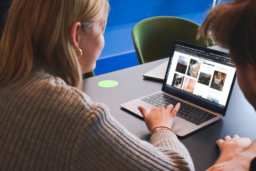
Creating a photography website, can you help you display your portfolio. However, visitors can only access your portfolio if the photography website navigation is easy to understand. Below, we will cover a few practices to improve the user experience through proper navigation.
1. Map the website structure
The first step is to map out the website structure on paper or using a mind map or flowchart software. Mapping out lets you know the pages that need to be organized using the navigation. Also, mapping out the pages first will help you create the navigation menu quickly.
2. Divide galleries according to the theme
Of Course, any photographer will have multiple galleries on the website. Rather than using any confusing navigation protocol, organizing different galleries according to the theme is best. Never should you have other photographs under the same gallery. When you do that, the visitors looking to hire you can easily go through your work and find the photos they are looking for, leading to a higher conversion rate.
3. Make the navigation menu prominent
Positioning the navigation menu is also important. Even if the navigation menu is perfect but if it’s not easy to access or easily visible, the users won’t be able to navigate through the website leading to a poor conversion rate and a higher bounce rate.
For desktop users, you can make the navigation menu floating. For mobile users, ensure the navigation menu icon is sticky. Thus, anyone can go through the navigation menu to discover the type of content they are looking for.
4. Use hierarchies
Not all pages on a website are of equal importance. To properly create a navigation menu, use a hierarchy or nested structures. Couple this with a drop-down menu; the navigation menu will be well organized even if you need to organize over 20 pages on the photography website.
5. Mention contact details on every page
Mostly, visitors will contact you once they take a look of the gallery. They ll go to the navigate menu to find a way to contact you. So, in order to convert that visitor, mention your contact details on every webpage for ease of access and improved conversion rate.
6. Do not skip the blog
You might often need to make an announcement or launch a new service. Creating such pages randomly will clutter the navigation menu. It will become difficult to organize such pages using the navigation menu.
Rather than randomly creating such pages, it is best to create a blog. You can make such announcements through blog posts. When you do that, you need not worry about the organization of various posts and simply need to add your blog to the navigation menu. Even hundreds of such announcements will be well organized when you post them on your professional photography website blog. Do not ignore these few tips while designing the photography website navigation. These tips will simply the navigation and make it easy for the user to find the information they are looking for, ultimately improving user experience.


